Apparently Auburn University changed its logo quite recently and was first reported on Thursday by Auburn Undercover. And the sudden change looks, well, I don't really know what to think of it. Personally I think the old logo is perfect. And I know most people will feel the same once the word gets out. Although the changes are slight, the new logo look just doesn't seem to capture the Auburn spirit. Here's a picture:
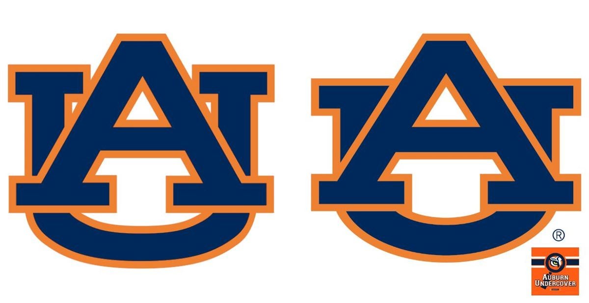
The logo is nice but we'll need some time to get used to it. The changes feature a smaller U to make the A stand out more. It's not yet known whether or not Auburn will use the new logo for the upcoming Football and Basketball season.
Absolutely no copyright intended whatsoever. All copyright belongs to Auburn University. Pictures only intended for example.
No comments:
Post a Comment